|
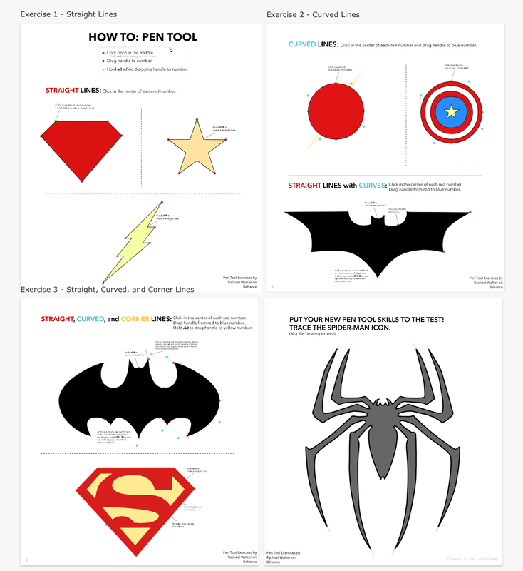
For this assignment, I was asked to create a logo with three different versions of it. First, I used the pen tool to make the words on my logo, and to make other deformed shapes. I also used the shape tool to make the banana and the nacho. Lastly, I used the subselect tool to edit the shapes and get the way I want it to look. Trying to fit the words in the shapes was the most challenging part. But I overcome it by trying my best and diligently working on it. 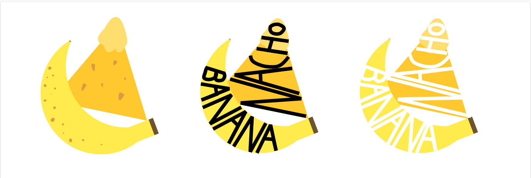 These are the three versions of the logo I created. These logos are based off a nickname I had from my friends. I decided to make a logo about it because I thought it would be funny to do so. This logo on the bottom is my favourite out of all three. It's because the first one seems to plain, and the words from the third version is hard to see. So, the second version of the logo is my favourite because the black words on the shape is easy to read and it grabs my attention. 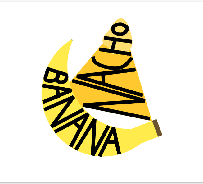
0 Comments
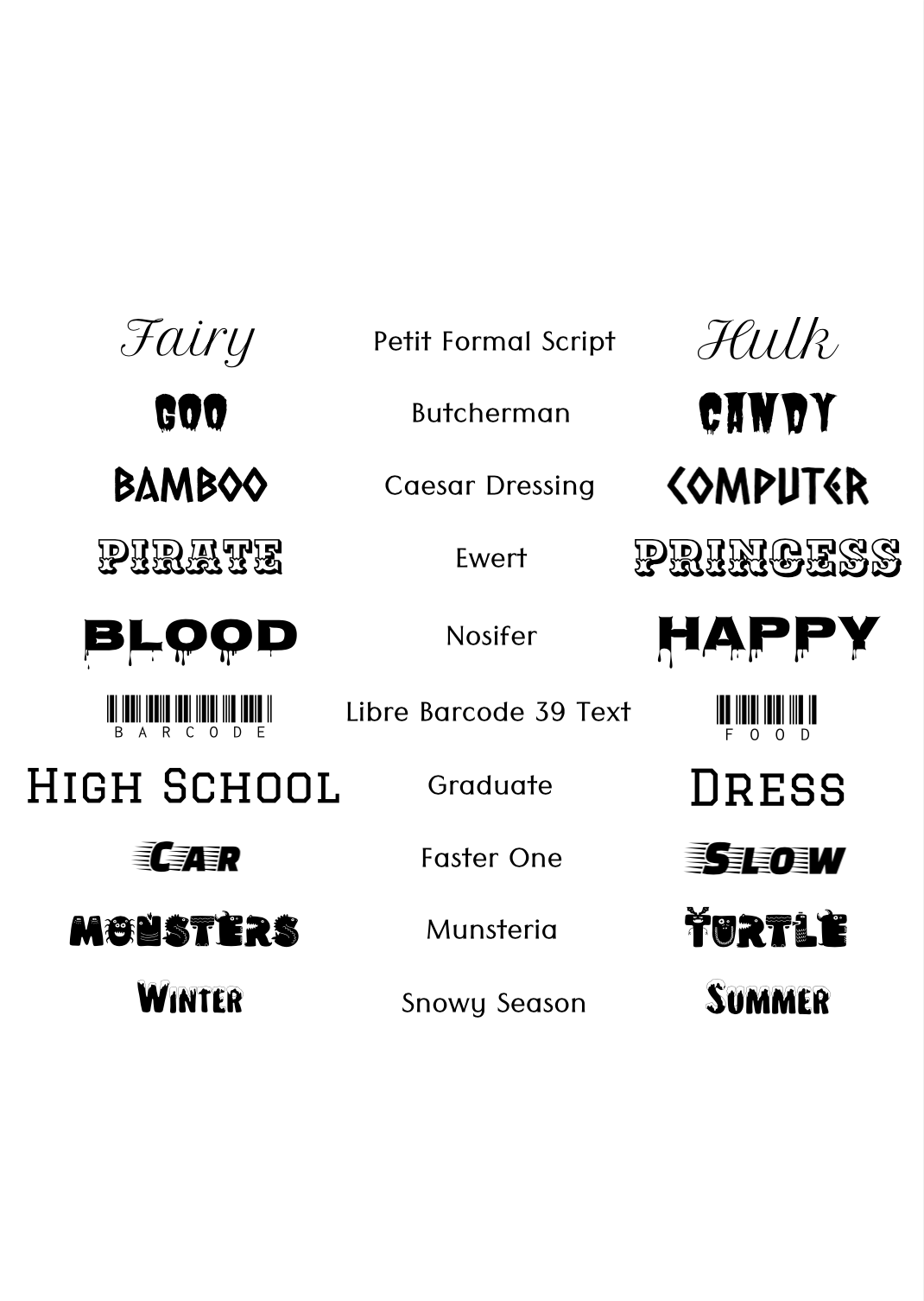
For these assignments, I had to create an artwork by using different colors and label each color with the RGB value and the HEX codes. For the Color Names assignment, I traced an illustration (you can check it yourself by clicking here) with the pen tool and filled it with 15 different colors. For the Color Schemes assignment, I created four different color palettes, monochromatic, analogous, complementary and triadic, by using the Adobe Color website. Then, I made little macaroons and filled in the colors from the palettes. Color Names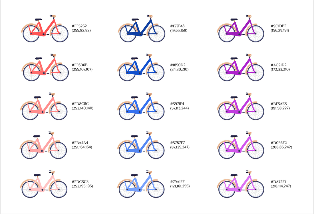 Color Schemes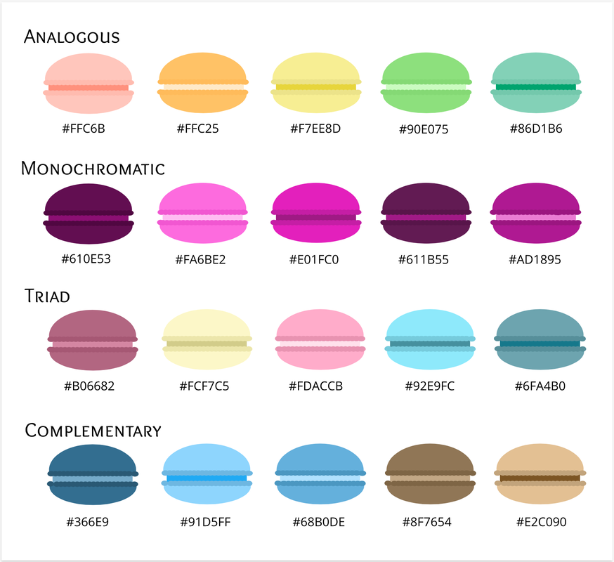 Typography is the style and appearance of a written word. Typography is important because it can help the reader to understand written words easier, and it could grab the attention of people. I think the quote "Each font has a personality and a purpose" means that each font has its own characteristics that distinguishes from the rest. Also, it means that certain fonts are meant to be used for certain things, and should not be used randomly. The 5 different fonts that I learned is Serif, Sans Serif, Monospaced, Script/Handwritten and Display. Serif has "feet" and it is used in large blocks of text or in prints. Whereas Sans Serif doesn't have "feet" and it's great for headlines, titles, and smaller chunks of texts. Monospaced has the same amount of texts in each letter, and it's not good for large blocks of texts. Script/Handwritten are cursive or calligraphic, and is good for logos, large headlines and details. Lastly, Display are fonts that grabs your attention and it should be used sparingly. Typeface comparisonFor this activity, I used the same phrase for all the different fonts to compare and contrast each of them. 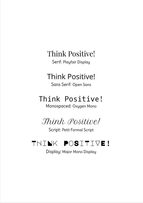
|
Archives
November 2020
Categories
All
 This work is licensed under a Creative Commons Attribution-NonCommercial-ShareAlike 4.0 International License. |