|
For this assignment, I was asked to create a logo with three different versions of it. First, I used the pen tool to make the words on my logo, and to make other deformed shapes. I also used the shape tool to make the banana and the nacho. Lastly, I used the subselect tool to edit the shapes and get the way I want it to look. Trying to fit the words in the shapes was the most challenging part. But I overcome it by trying my best and diligently working on it. 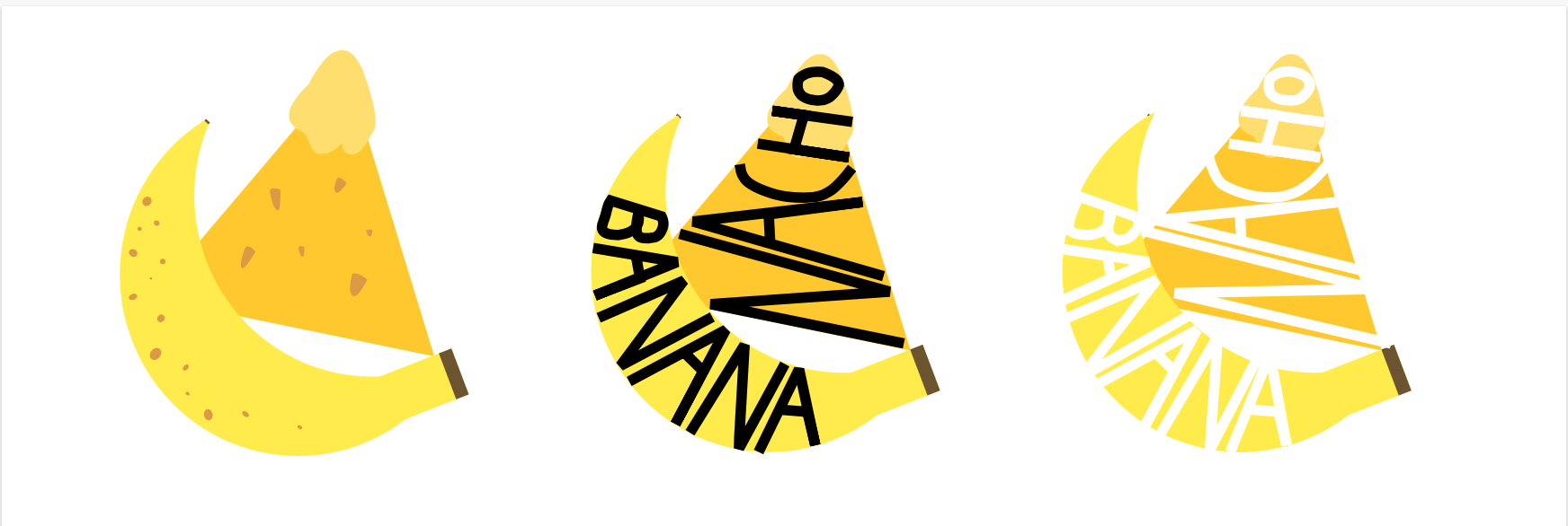 These are the three versions of the logo I created. These logos are based off a nickname I had from my friends. I decided to make a logo about it because I thought it would be funny to do so. This logo on the bottom is my favourite out of all three. It's because the first one seems to plain, and the words from the third version is hard to see. So, the second version of the logo is my favourite because the black words on the shape is easy to read and it grabs my attention. 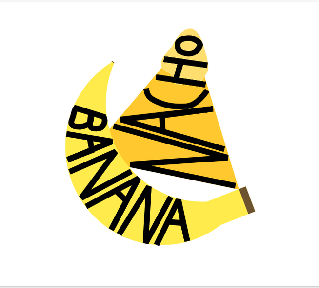
0 Comments
Leave a Reply. |
Archives
November 2020
Categories
All
 This work is licensed under a Creative Commons Attribution-NonCommercial-ShareAlike 4.0 International License. |
